Brand Clarity, Brand Identity, and Web Design
The Challenge
Rockwood Community Development Corporation is a multi-faceted organization based in Gresham, Oregon, just outside Portland. They facilitate collaborative solutions with neighbors and local leaders, in providing pathways for Rockwood residents to thrive educationally, economically, and interpersonally. When we started working together, they had an outdated brand, a broken website, and a complex brand narrative that was difficult to describe to donors, partners, and community members.
The Outcome
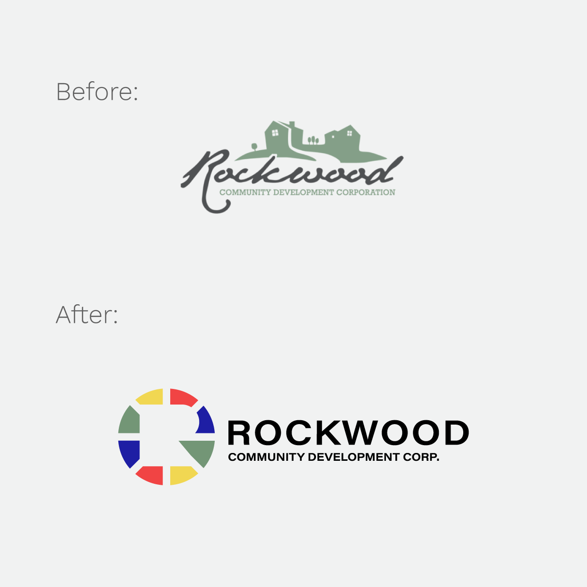
We worked with the Rockwood team on streamlining the complexity of their work, collaborating with them to simplify their mission statement and core messaging. We redesigned their parent logo and each of the logos for their key initiatives.
Over two years, we worked closely with their team to launch a new website for the parent organization and microsites for their key initiatives.
With each new visual identity for their initiatives, we helped them develop a communications plan to convey the innovative work they are doing in Oregon's poorest community.
We ended up with a new brand that gives razor-sharp clarity to their work, provides them with a solid foundation for grant applications, and tells the story of Rockwood in a way that honors the people they serve.
As a part of the brand strategy process, we developed messaging for their vision, mission, taglines, and short and extended versions of problem and solution statements.
Vision
We dream of a Rockwood where everyone has an opportunity to learn, earn, and belong.
Mission
We work in Oregon’s poorest community to help provide pathways for Rockwood residents to move from poverty to prosperity.
Expanded Mission Statement
We work in Oregon’s poorest community to help provide pathways for Rockwood residents to move from poverty to prosperity by:
- Expanding the supply of affordable housing
- Stimulating and supporting economic development
- Increasing access to healthcare and encouraging healthy behavior
- Creating and sustaining public-private partnerships
- Aligning the strategies and resources of the educational, faith-based, governmental, capital, social service, business, and healthcare sectors
Problem/Solution (Short Version)
Rockwood is Oregon’s poorest community. We work alongside our neighbors to co-create a new future together.
Problem/Solution (Extended Version)
As a historically neglected and under-invested community, Rockwood’s 40,000 residents have a life expectancy that is 10-years shorter than other parts of the Portland Metro area. We facilitate collaborative solutions with neighbors and local leaders that provide pathways for Rockwood residents to thrive educationally, economically, and relationally.
Core Program Development
Rockwood CDC’s team constantly innovates and responds to the community's needs. When explaining their work, it was often hard to explain to potential donors, partners, and community members what they actually “do.” We worked with their team to summarize their overall work into three key categories, which made it easier for them to understand the scope of their work.
Health Outcomes
Working to increase core health outcomes and develop sustainable and holistic food systems.
Housing Solutions
Advocating for housing system change in Rockwood and East County.
Economic Development
Stimulating entrepreneurship in Rockwood and East Multnomah County.
Other components of the brand strategy include the following:
- Why Statement
- Core Values
- Brand Voice & Personality
- Program/Service Descriptions
- Positioning
- Target Audience
- Calls To Action
- Brand Narrative
- Elevator Pitch
Logo and Visual Branding
When reimagining Rockwood CDC's new logo, we knew we needed to modernize its look while having it be connected to the community. We created a look that clearly and subconsciously represents their work as well as the community of Rockwood.
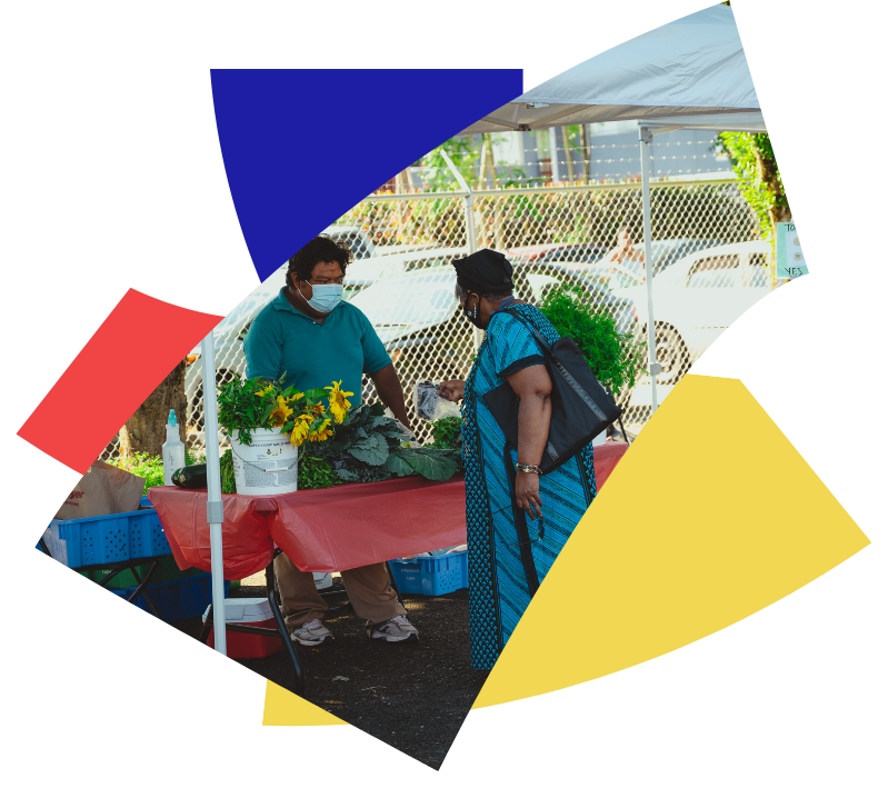
The Rockwood community is diverse.
As Rockwood dreams about a brighter future, they continue to invite a full representation of their community to the table to create that future together. The various colors found in the new logo paint a picture of the beauty and diversity of Rockwood, and the circle represents a table where there is a seat for every member of the community.
The work of Rockwood CDC is multifaceted.
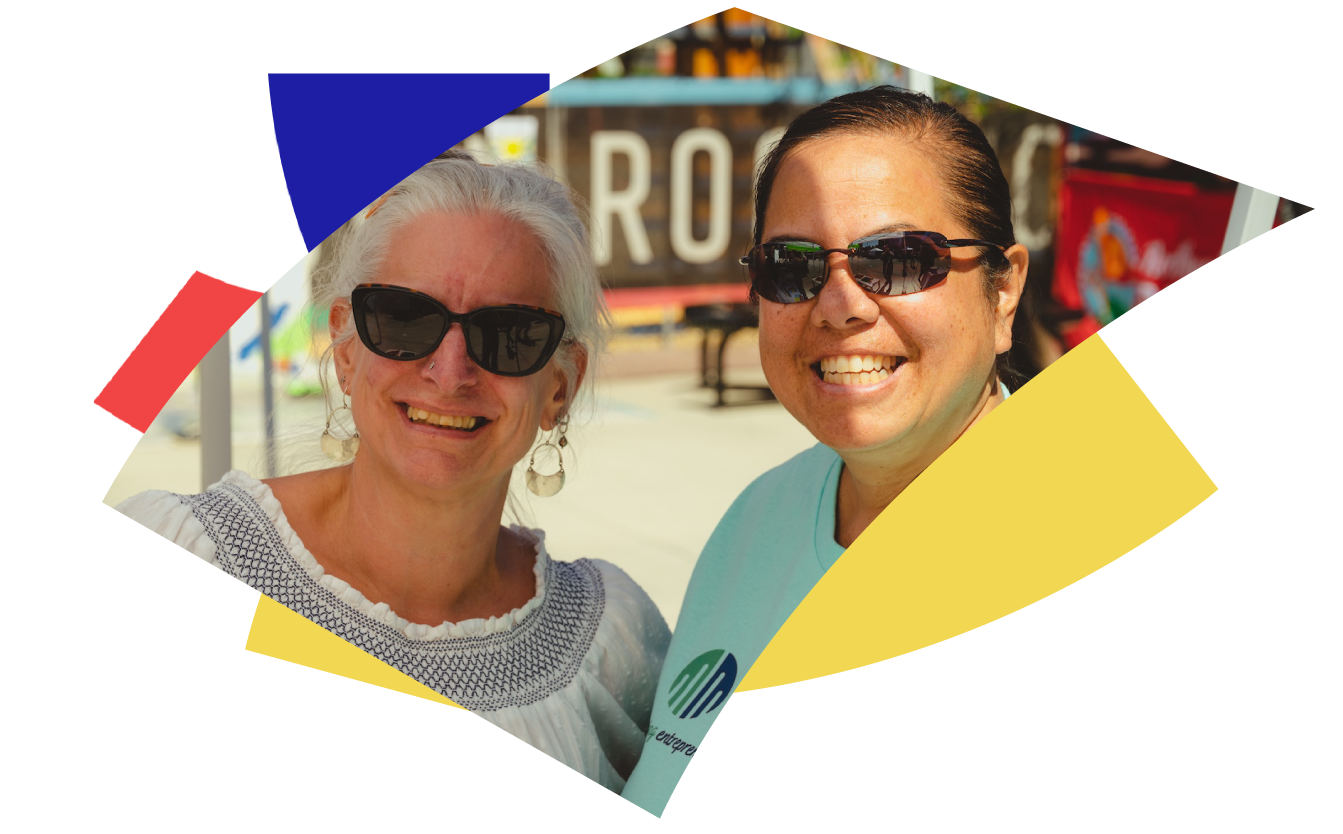
The solutions to the challenges in Rockwood will continue to take on various shapes and forms. The new logo conveys the idea that there is no one-size-fits-all solution to the problems in a complex community like Rockwood.
Rockwood is invisible to the Portland Metro area.
Rockwood is a community that most people in the region do not see, recognize, or understand. This new logo intentionally features the “R” in Rockwood in a way that conveys that Rockwood has been ignored by those outside the community. However, if you look close enough and adjust your perspective, you will begin to see it more clearly.
Rockwood Initiatives: A Family of Brands
Rockwood CDC's model includes the development of sub-brands for each of their distinct initiatives. We worked with Rockwood CDC's team to design a series of logos that felt like a family yet maintained their distinctness from one another.



A Branded Engagement Strategy
For years, the Rockwood team has hosted in-person Lunch and Learn gatherings that gave people an opportunity to learn about their work, their model, and ways people can engage in the Rockwood community.
During the COVID-19 pandemic, we helped them re-brand and re-launch a virtual version of this gathering. Since 2020, hundreds of people have participated in these monthly Zoom meetings.
Liminal Creative has done incredible work for our organization. I heartily recommend them!
Brad Ketch
Rockwood CDC
Founder & Chairman of the Board
Let's work together
We would love to work together to elevate the important work you are doing.

